Bonus Interview With Book Cover Artist/Graphic Designer, Ken Dawson
21 Saturday Dec 2013
Written by susanfinlay
I’d like to introduce you to a good friend of mine from the U.K. He is a book cover artist/graphic designer. Meet Ken Dawson.
Hi, Ken! Welcome to Susan Finlay Writes blog site. Can you tell us a bit about your background as a graphic designer and illustrator?
Hi Susan! Thanks again for having me! Well after I left school, I went to college to study Graphic Design. Back then after completing the course I felt it wasn’t a career I wanted to pursue, so I went on to study Art and Animation at university. Once I graduated by some strange twist of fate I managed to get a job as a Graphic Designer and my passion for the subject returned. I’ve been a designer now for over ten years.
You work with book publishers, designing covers for their authors’ books, but you also have your own company and website for freelance book cover designs. What are the main differences between working with a publisher and working freelance?
I guess when you’re working alongside publishers there are many more heads working together and thus more ideas are being put forward. Sometimes this is a good thing as with a group you can pull together a host of imaginations. But when it’s just you and the author, you develop a closer bond and this helps you to give them exactly what they are looking for.
What is it like to work with the authors on book covers? Are the authors typically involved in the design concepts, or do they usually leave that up to you?
It all depends on the individual. Some authors will give you complete freedom and allow you to show them your ideas and concepts. Whereas others will be have a clear idea of what what they would like to see. I enjoy working with all authors whatever their vision for their cover.
How do you come up with the concepts? Do you read the book, or do you discuss it with the author and/or publisher? How do you decide whether to use photography or original artwork?
Initially we talk about the book itself and the genre it fits into. I’ll also read blurbs and/or a few chapters. Once I get a feel about the work I make a few sketches and get the publisher’s feedback. If they already have an idea of what it will look like I’ll usually go straight into making some designs. During discussions we will make a decision whether to use photography or illustrations.
What usually comes first when creating a book cover—the choice of color palette, theme/concept, picture, typography, layout, etc.? Do you create multiple options and then choose from them the way a photographer does with proofs?
Yes I usually show several sketched layouts before looking at colours. Again multiple ideas will be given before we move into looking at typography for the titles, author name etc. There are always multiple options throughout each stage of development.
Do you sketch the cover before you begin? I sometimes see your work-in-progress on Facebook. Can you show us some of those?
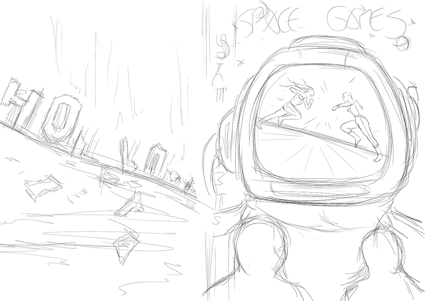
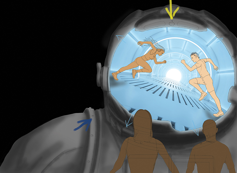
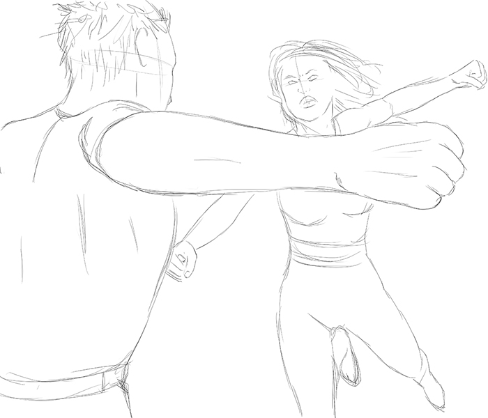
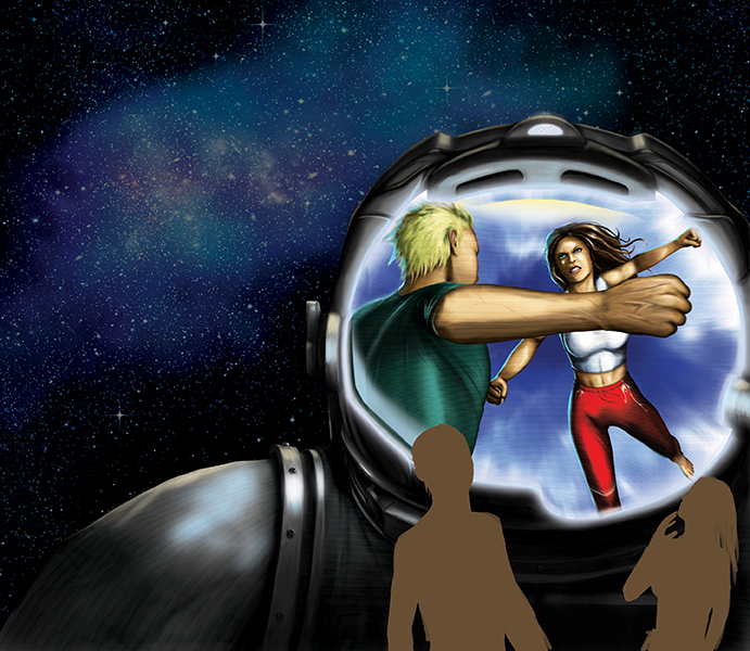
Yes of course. Here is some of the development for Dean Lombardo’s Space Games. The publisher had the idea of having a screen within a space helmet displaying a fight between the two central characters. At some point during colouring it was decided that the fight wasn’t dynamic enough. Another fight was drawn and placed into the image. Throughout the entire process many versions were created at every stage.
Of all your artwork, is there anything you are most proud of? Will you give us some samples of your finished covers?
I’m proud of every cover I do. I’m only happy when the author and publishers are happy. I have a gallery of work on my site that can be viewed here. http://www.ccovers.co.uk/gallery/
Do you ever get an assignment that leaves you scratching your head?
I’ll be honest, pretty much all the covers start this way. But after a sit down, a chat, and a few scribbles, ideas begin to form. Sometimes it helps to have music playing that fit the genre whilst brainstorming. Daydreaming can be a huge asset to help overcome blocks.
Can you tell us a bit about how you create a book cover that generates excitement? Is there a formula?
Some designers will say there is a fine art to pulling a viewer’s eye towards the cover and then having focus on a particular point. To me, this ‘science’ doesn’t always work. I feel a clear, strong image that compliments bold, easy to read typography should always be the foundation of every cover. It sounds so simple but I’ve seen covers that seem to forget this rule and end up looking muddled and messy.
What book genres do you like to create covers for?
I enjoy creating covers for all types of genre. I don’t think I have a particular favourite as each genre throws up it’s own challenges.
What are your fees and how can authors and publishers contact you?
I have a flat fee of £100/$160 which will only be requested once the cover is completed and the author is happy. For custom painted artwork the price can increase slightly depending on the level of work required.
My site is www.ccovers.co.uk and I can be reached at [email protected].
My personal facebook page: https://www.facebook.com/KennyDreadful
Creative Covers facebook page: https://www.facebook.com/ccoverskendawson
My personal blog: www.kennydreadful.com
Creative Covers Twitter: https://twitter.com/CreativeCovers1


3 Comments
December 25, 2013 at 10:07 pm
Wishing you a Merry Christmas touched with wonder and filled with love.
January 16, 2014 at 8:04 am
Its really nice posting. I think it would be helpful for all. Thank you for sharing with us.
January 16, 2014 at 12:42 pm
Thanks, Jacobus.